
Twill / Vue 3 block party

Now that we have set up all the tools to create blocks on both Twill and Vue sides, let's create some generic blocks.
Each block will be created in the Common namespace and will be manually added as an allowed block in the controller of our PageContent Module, and declared and called in our Module Inertia Page.
For example, for a Codivores block:
/app/Http/Controllers/Admin/PageContentController.php
            BlockEditor::make()
                ->withoutSeparator()
                ->blocks([
                    'common-codivores',
                ])
/resources/views/Pages/Page/Content.vue
// <script>
const BlockCommonCodivores = defineAsyncComponent(() => import('@Block/Common/Codivores.vue'))
// </script>

// <template>
<div
  v-for="(block, index) in item.blocks"
  :key="index"
>
  ...
  <BlockCommonCodivores
    v-else-if="block.type == 'common-codivores'"
    :block="block"
  ></BlockCommonCodivores>
</div>
// </template>
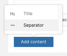
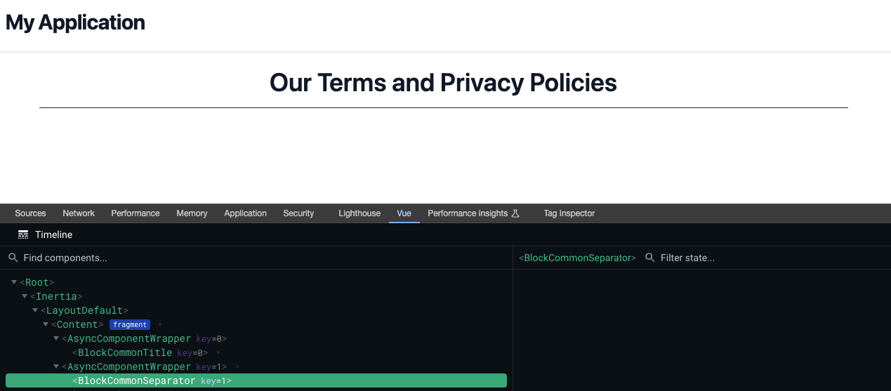
Separator Block
Let's start with simple things; it is entirely possible to create a block without manageable content (this can also be the useful for blocks that will load asynchronously their content through Fetch API).
Twill Block component
/app/View/Components/Twill/Blocks/Common/Separator.php
<?php

namespace App\View\Components\Twill\Blocks\Common;

use A17\Twill\Services\Forms\Form;

class Separator extends Base
{
    public function getForm(): Form
    {
        return Form::make();
    }

    public static function getBlockTitle(): string
    {
        return __('Separator');
    }

    public static function getBlockIcon(): string
    {
        return 'more-dots';
    }
}
Preview of the Twill BlockEditor

Vue 3 Block component
/resources/views/Components/Theme/Block/Common/Separator.vue
<script setup lang="ts">
defineOptions({
  name: 'BlockCommonSeparator',
})
</script>

<template>
  <div class="mx-auto my-4 max-w-6xl">
    <hr class="w-full border-t border-gray-800" />
  </div>
</template>
Preview of the Inertia Page
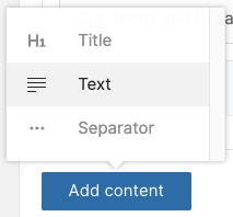
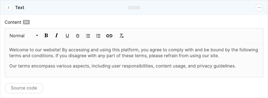
Text Block
It's now time to enable HTML content in our blocks using Twill's WYSIWYG field.
To achieve this, we will enhance our BlockComponent class with new methods:
fieldWysiwygTypeDefault(): we will use thequill(https://quilljs.com) editor instead of defaulttiptap(https://tiptap.dev)fieldWysiwygToolbarOptionsDefault(): our default toolbar with options that we decide to allow (it is also possible to add colorization with a list of hexadecimal codes)fieldWysiwygToolbarOptionsLight(): light toolbar that can be useful for certain content types
/app/View/Components/Twill/Blocks/Base/BlockComponent.php
...

    public static function fieldWysiwygTypeDefault(): string
    {
        return 'quill';
    }

    public static function fieldWysiwygToolbarOptionsDefault(): array
    {
        return [
            ['header' => [2, 3, 4, false]],
            'bold',
            'italic',
            'underline',
            'strike',
            ['list' => 'bullet'],
            ['list' => 'ordered'],
            'link',
            'clean',
            // ['color' => ["#747E8C", "#54D52B", "#3BA618", "#00B2D2", "#FBC000"]],
        ];
    }

    public static function fieldWysiwygToolbarOptionsLight(): array
    {
        return [
            'bold',
            'italic',
            'clean',
        ];
    }

...
Twill Block component
/app/View/Components/Twill/Blocks/Common/Text.php
<?php

namespace App\View\Components\Twill\Blocks\Common;

use A17\Twill\Services\Forms\Form;
use A17\Twill\Services\Forms\Fields\Wysiwyg;

class Text extends Base
{
    public function getForm(): Form
    {
        return Form::make([
            Wysiwyg::make()
                ->name('content')
                ->label(__('Content'))
                ->type(self::fieldWysiwygTypeDefault())
                ->toolbarOptions(self::fieldWysiwygToolbarOptionsDefault())
                ->allowSource()
                ->translatable(),
        ]);
    }

    public static function getBlockTitle(): string
    {
        return __('Text');
    }

    public static function getBlockIcon(): string
    {
        return 'text';
    }
}
Preview of the Twill BlockEditor
Vue 3 Block component
/resources/views/Components/Theme/Block/Common/Text.vue
<script setup lang="ts">
defineOptions({
  name: 'BlockCommonText',
})

interface Props {
  block: Model.Block & PropsBlock
}

type PropsBlock = {
  content: {
    content?: string | null
  }
}

defineProps<Props>()
</script>

<template>
  <div
    v-if="block.content?.content"
    v-html="block.content.content"
    class="text-gray-700 text-justify [&>p]:pb-4"
  ></div>
</template>
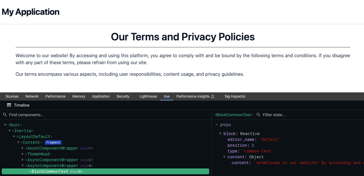
Preview of the Inertia Page
Button Block
Now, let's focus on buttons. In addition to a translatable URL and label, we will enable the selection of a type for standard (default) or CTA button.
A small Vue-side nuance: we will use the Inertia Link component for internal links and an HTML <a> tag with target="_blank" for external links.
Twill Block component
/app/View/Components/Twill/Blocks/Common/Button.php
<?php

namespace App\View\Components\Twill\Blocks\Common;

use A17\Twill\Services\Forms\Columns;
use A17\Twill\Services\Forms\Fields\Input;
use A17\Twill\Services\Forms\Fields\Select;
use A17\Twill\Services\Forms\Form;
use A17\Twill\Services\Forms\Option;
use A17\Twill\Services\Forms\Options;

class Button extends Base
{
    public function getForm(): Form
    {
        return Form::make([

            Columns::make()
                ->left([
                    Input::make()
                        ->name('label')
                        ->label(__('Label'))
                        ->translatable()
                        ->required()
                ])
                ->right([
                    Input::make()
                        ->name('url')
                        ->label(__('URL'))
                        ->translatable()
                        ->required()
                ]),

            Select::make()
                ->name('type')
                ->label(__('Type'))
                ->options(
                    Options::make([
                        Option::make('std', __('Standard')),
                        Option::make('cta', __('Call To Action')),

                    ])
                )
                ->default('std')
        ]);
    }

    public static function getBlockTitle(): string
    {
        return __('Button');
    }

    public static function getBlockIcon(): string
    {
        return 'revision-single';
    }
}
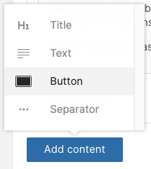
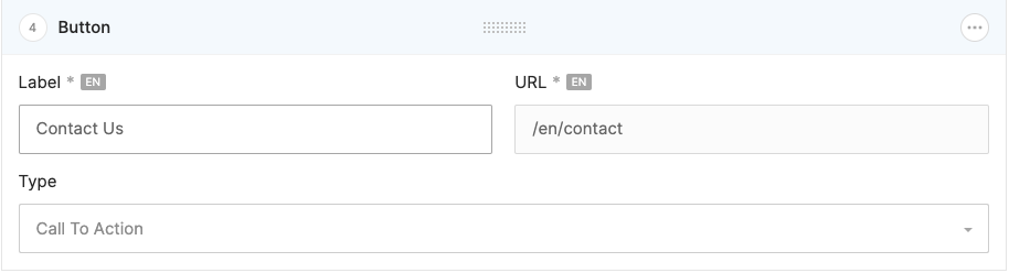
Preview of the Twill BlockEditor
Vue 3 Block component
/resources/views/Components/Theme/Block/Common/Button.vue
<script setup lang="ts">
import { Link } from '@inertiajs/vue3'

defineOptions({
  name: 'BlockCommonButton',
})

interface Props {
  block: Model.Block & PropsBlock
}

type PropsBlock = {
  content: {
    label?: string | null
    url?: string | null
    type?: string | null
  }
}

const props = defineProps<Props>()

const classes = computed(() =>
  (props.block?.content?.type == 'cta'
    ? 'bg-teal-600 hover:bg-teal-800 uppercase'
    : 'bg-gray-500 hover:bg-gray-700'
  ).concat(' rounded px-5 py-3 font-bold text-white')
)
</script>

<template>
  <div
    v-if="block.content?.url && block.content?.label"
    class="flex justify-center my-2"
  >
    <template v-if="block.content.url?.startsWith('http')">
      <a
        :href="block.content.url"
        target="_blank"
      >
        <button :class="classes">
          {{ block.content.label }}
        </button>
      </a>
    </template>
    <template v-else>
      <Link :href="block.content.url">
        <button :class="classes">
          {{ block.content.label }}
        </button>
      </Link>
    </template>
  </div>
</template>
Preview of the Inertia Page
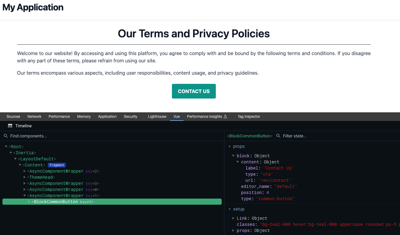
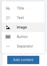
Image Block
Another type of content that will likely be used in a project is images. Twill handles this exceptionally well with medias
To streamline our workflow for media management, we will make some adaptations:
Enhancing our
computeBlock()method to handle medias and include only necessary information (src, height, width, alt, caption and video attributes)Creating a
PictureVue component: naturally, you can customize the integration as you prefer or according to your project needs, and there are also solutions like TwicPics or Imgix that not only offer CDN functionalities but also could display cropped images at the correct ratio automaticallyEnriching our TypeScript types
In this example, we will use Twill's standard roles, namely desktop (16/9), tablet (4/3), and mobile (1). Again, feel free to adapt these according to your preferences, depending on the project, the Module where it is used, ...
/app/Models/Base/Model.php
class Model extends TwillModel
{
    private function computeBlock($block, string $locale, string $fallbackLocale = null): array
    {
        // Handle medias.
        if (isset($block->medias) && count($block->medias) > 0) {
            $medias = [];
            $roles = $block
                ->medias
                ->unique('pivot.role')
                ->pluck('pivot.role');

            foreach ($roles as $role) {
                $images = $block->imagesAsArraysWithCrops($role);
                $medias[$role] = (is_array($images) && count($images) > 1) ? $images : reset($images);
            }

            $block->medias = $medias;
        }

...

        return $block->only(Arr::collapse(
            [
                [
                    'editor_name',
                    'position',
                    'type',
                    'content',
                ],
                (count($block->medias) > 0) ? ['medias'] : [],
                ($block->childs && count($block->childs) > 0) ? ['childs'] : []
            ]
        ));
    }
}
/resources/views/Components/Theme/UI/Picture.vue
@@ -0,0 +1,121 @@
<script setup lang="ts">
defineOptions({
  name: 'ThemeUiPicture',
  inheritAttrs: false,
})

interface Props {
  media?: Model.Media | null
  mediaList?: Model.MediaWithRoles | null
  sizes?: number | object | null
  lazy?: boolean
  caption?: boolean
}

const props = withDefaults(defineProps<Props>(), {
  media: null,
  mediaList: null,
  lazy: false,
  caption: false,
})

const extensionList = ['webp', 'jpg']

const sizes =
  props.sizes && typeof props.sizes == 'number'
    ? {
        mobile: props.sizes,
        tablet: props.sizes,
        desktop: props.sizes,
        default: props.sizes,
      }
    : Object.assign(
        {
          mobile: 768,
          tablet: 1024,
          desktop: 1536,
          default: 1536,
        },
        props.sizes
      )

const figure = computed(() => {
  if (props.mediaList !== null && props.mediaList?.mobile && props.mediaList?.tablet && props.mediaList?.desktop) {
    return {
      sources: [
        {
          crop: 'mobile',
          object: props.mediaList.mobile,
          size: sizes.mobile,
          media: '(max-width: 768px)',
        },
        {
          crop: 'tablet',
          object: props.mediaList.tablet,
          size: sizes.tablet,
          media: '(max-width: 1024px)',
        },
        {
          crop: 'desktop',
          object: props.mediaList.desktop,
          size: sizes.desktop,
          media: '(min-width: 1025px)',
        },
      ],
      caption:
        props.caption && props.mediaList.desktop?.caption && props.mediaList.desktop.caption !== ''
          ? props.mediaList.desktop.caption
          : null,
    }
  } else if (props.media) {
    return {
      sources: [
        {
          crop: 'default',
          object: props.media,
          size: sizes.default,
          media: '(min-width: 1px)',
        },
      ],
      caption: props.caption && props.media?.caption && props.media.caption !== '' ? props.media.caption : null,
    }
  }

  return null
})
</script>

<template>
  <figure class="w-full h-auto">
    <template v-if="figure && figure.sources">
      <picture>
        <template
          v-for="(media, index) in figure.sources"
          :key="index"
        >
          <template v-if="media.object && media.object.src">
            <source
              v-for="imageFormat in extensionList"
              :srcset="`${media.object.src}&fm=webp&w=${media.size}`"
              :media="media.media"
              :type="`image/${imageFormat}`"
            />
            <img
              v-if="index == figure.sources.length - 1"
              :src="`${media.object.src}&fm=webp&w=${media.size}`"
              :alt="media.object?.alt"
              v-bind="$attrs"
              :loading="lazy ? 'lazy' : 'eager'"
              class=""
            />
          </template>
        </template>
      </picture>
      <template v-if="caption && figure.caption !== null">
        <figcaption class="w-full text-xs text-center py-1">
          {{ figure.caption }}
        </figcaption>
      </template>
    </template>
  </figure>
</template>
/resources/js/types/models.d.ts
declare namespace Model {
  export type Page = {
    ...
    medias: {} | null
  }

  export type Media = {
    alt?: string
    caption?: string
    height: number
    src?: string
    video?: string
    width: number
  }

  export type MediaWithRoles = {
    default?: Media
    desktop?: Media
    mobile?: Media
    tablet?: Media
  }
}
Twill Block component
/app/View/Components/Twill/Blocks/Common/Image.php
<?php

namespace App\View\Components\Twill\Blocks\Common;

use A17\Twill\Services\Forms\Form;
use A17\Twill\Services\Forms\Fields\Medias;

class Image extends Base
{
    public function getForm(): Form
    {
        return Form::make([
            Medias::make()
                ->name('common_image')
                ->label(__('Image'))
                ->max(1)
        ]);
    }

    public static function getCrops(): array
    {
        return [
            'common_image' => [
                'desktop' => [
                    [
                        'name' => 'desktop',
                        'ratio' => 16 / 9,
                        'minValues' => [
                            'width' => 1200,
                            'height' => 675,
                        ],
                    ],
                ],
                'tablet' => [
                    [
                        'name' => 'tablet',
                        'ratio' => 4 / 3,
                    ],
                ],
                'mobile' => [
                    [
                        'name' => 'mobile',
                        'ratio' => 1,
                    ],
                ],
            ],
        ];
    }

    public static function getBlockTitle(): string
    {
        return __('Image');
    }

    public static function getBlockIcon(): string
    {
        return 'image';
    }
}
Preview of the Twill BlockEditor
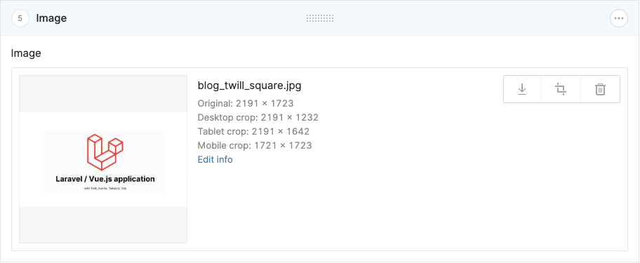
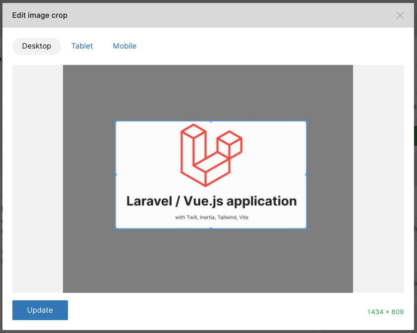
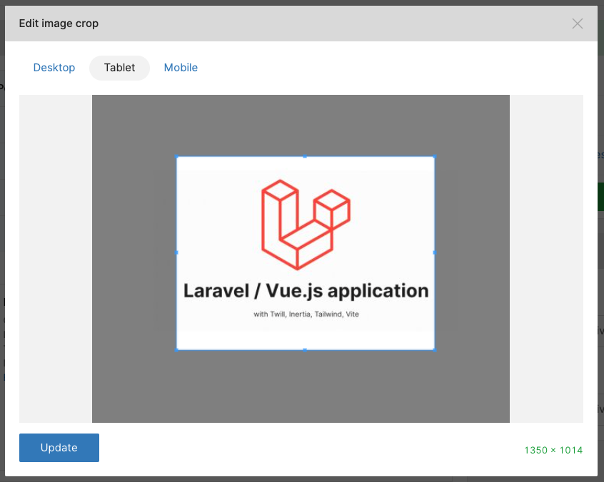
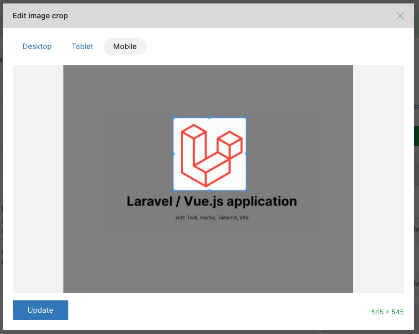
Then you can edit the crop for each role:
Vue 3 Block component
/resources/views/Components/Theme/Block/Common/Image.vue
<script setup lang="ts">
import Picture from '@Theme/UI/Picture.vue'

defineOptions({
  name: 'BlockCommonImage',
})

interface Props {
  block: Model.Block & PropsBlock
}

type PropsBlock = {
  medias: {
    common_image?: Model.MediaWithRoles
  }
}

defineProps<Props>()
</script>

<template>
  <div
    v-if="block?.medias?.common_image"
    class="my-4"
  >
    <Picture
      :mediaList="block.medias.common_image"
      class="w-full"
    ></Picture>
  </div>
</template>
Preview of the Inertia Page
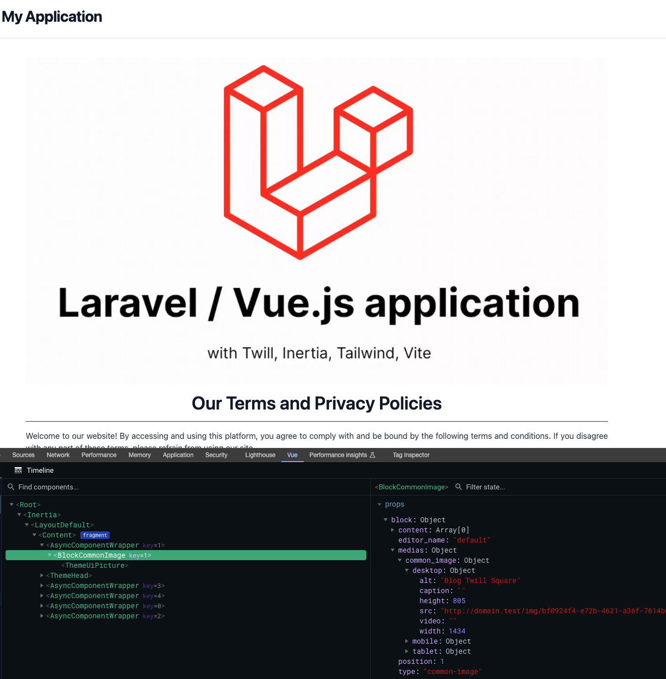

Image Unconstrained Block
A more permissive version of the Image Block, with a single role and an unrestricted free ratio for unconstrained image display.
Twill Block component
/app/View/Components/Twill/Blocks/Common/ImageUnconstrained.php
<?php

namespace App\View\Components\Twill\Blocks\Common;

use A17\Twill\Services\Forms\Form;
use A17\Twill\Services\Forms\Fields\Medias;

class ImageUnconstrained extends Base
{
    public function getForm(): Form
    {
        return Form::make([
            Medias::make()
                ->name('common_unconstrained_image')
                ->label(__('Image'))
                ->max(1)
        ]);
    }

    public static function getCrops(): array
    {
        return [
            'common_unconstrained_image' => [
                'default' => [
                    [
                        'name' => 'default',
                        'ratio' => 'free',
                    ],
                ],
            ],
        ];
    }

    public static function getBlockTitle(): string
    {
        return __('Unconstrained image');
    }

    public static function getBlockIcon(): string
    {
        return 'image';
    }
}
Vue 3 Block component
/resources/views/Components/Theme/Block/Common/ImageUnconstrained.vue
<script setup lang="ts">
import Picture from '@Theme/UI/Picture.vue'

defineOptions({
  name: 'BlockCommonImageUnconstrained',
})

interface Props {
  block: Model.Block & PropsBlock
}

type PropsBlock = {
  medias: {
    common_unconstrained_image?: Model.MediaWithRoles
  }
}

defineProps<Props>()
</script>

<template>
  <div
    v-if="block?.medias?.common_unconstrained_image?.default"
    class="my-4"
  >
    <Picture
      :media="block.medias.common_unconstrained_image.default"
      class="w-full"
    ></Picture>
  </div>
</template>
Paragraph Block
Just for fun, a component with conditional title, subtitle and content, that leverages our previous Text component for the content field.
Twill Block component
/app/View/Components/Twill/Blocks/Common/Paragraph.php
<?php

namespace App\View\Components\Twill\Blocks\Common;

use A17\Twill\Services\Forms\Fields\Input;
use A17\Twill\Services\Forms\Form;
use A17\Twill\Services\Forms\Fields\Wysiwyg;

class Paragraph extends Base
{
    public function getForm(): Form
    {
        return Form::make([
            Input::make()
                ->name('title')
                ->label(__('Title'))
                ->translatable(),

            Input::make()
                ->name('subtitle')
                ->label(__('Subtitle'))
                ->translatable(),

            Wysiwyg::make()
                ->name('content')
                ->label(__('Content'))
                ->type(self::fieldWysiwygTypeDefault())
                ->toolbarOptions(self::fieldWysiwygToolbarOptionsDefault())
                ->allowSource()
                ->translatable(),
        ]);
    }

    public static function getBlockTitleField(): ?string
    {
        return 'title';
    }

    public static function getBlockTitle(): string
    {
        return __('Paragraph');
    }

    public static function getBlockIcon(): string
    {
        return 'content-editor';
    }
}
Preview of the Twill BlockEditor
Vue 3 Block component
/resources/views/Components/Theme/Block/Common/Paragraph.vue
<script setup lang="ts">
import Text from './Text.vue'

defineOptions({
  name: 'BlockCommonParagraph',
})

interface Props {
  block: Model.Block & PropsBlock
}

type PropsBlock = {
  content: {
    title?: string | null
    subtitle?: string | null
    content?: string | null
  }
}

defineProps<Props>()
</script>

<template>
  <div
    v-if="block?.content?.title || block?.content?.subtitle || block?.content?.content"
    class="my-4"
  >
    <h2
      v-if="block?.content?.title"
      v-html="block.content.title"
      class="text-2xl font-bold mb-1"
    ></h2>
    <h2
      v-if="block?.content?.subtitle"
      v-html="block.content.subtitle"
      class="text-xl font-semibold mb-1"
    ></h2>
    <Text
      v-if="block?.content?.content"
      :block="block"
    ></Text>
  </div>
</template>
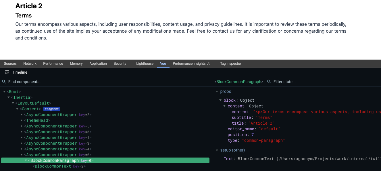
Preview of the Inertia Page
Sandbox - Pricing Plan Block
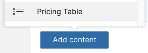
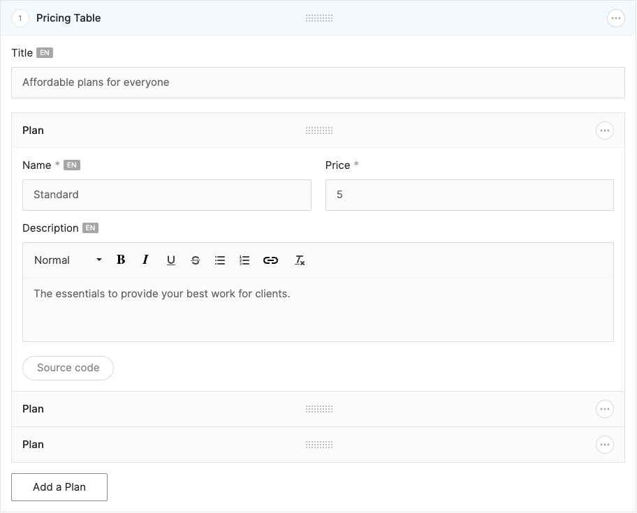
An example to show the use of the Twill InlineRepeater, enabling the easy creation of dynamic content lists.
For the demonstration, we will create a pricing table.
Twill Block component
/app/View/Components/Twill/Blocks/Sandbox/PricingTable.php
<?php

namespace App\View\Components\Twill\Blocks\Sandbox;

use A17\Twill\Services\Forms\Columns;
use A17\Twill\Services\Forms\Fields\Input;
use A17\Twill\Services\Forms\Form;
use A17\Twill\Services\Forms\Fields\Wysiwyg;
use A17\Twill\Services\Forms\InlineRepeater;

class PricingTable extends Base
{
    public function getForm(): Form
    {
        return Form::make([
            Input::make()
                ->name('title')
                ->label(__('Title'))
                ->translatable(),

            InlineRepeater::make()
                ->name('pricing')
                ->label(__('Plan'))
                ->triggerText(__('Add a Plan'))
                ->fields([
                    Columns::make()
                        ->left([
                            Input::make()
                                ->name('name')
                                ->label(__('Name'))
                                ->translatable()
                                ->required(),
                        ])
                        ->right([
                            Input::make()
                                ->name('price')
                                ->label(__('Price'))
                                ->required()
                                ->type('number')
                                ->min(0),
                        ]),

                    Wysiwyg::make()
                        ->name('description')
                        ->label(__('Description'))
                        ->type(self::fieldWysiwygTypeDefault())
                        ->toolbarOptions(self::fieldWysiwygToolbarOptionsDefault())
                        ->allowSource()
                        ->translatable(),

                ])
        ]);
    }

    public static function getBlockTitle(): string
    {
        return __('Pricing Table');
    }

    public static function getBlockIcon(): string
    {
        return 'b-checklist';
    }
}
Preview of the Twill BlockEditor
Vue 3 Block component
/resources/views/Components/Theme/Block/Sandbox/PricingTable.vue
<script setup lang="ts">
defineOptions({
  name: 'BlockSandboxPricingTable',
})

interface Props {
  block: Model.Block & PropsBlock
}

type PropsBlock = {
  content: {
    title?: string | null
    subtitle?: string | null
    content?: string | null
  }
  childs: PropsChildBlock[]
}

type PropsChildBlock = {
  content: {
    name?: string | null
    price?: string | null
    description?: string | null
  }
}

defineProps<Props>()

/**
 * Tailwind dynamic classes.
 * opacity-60
 * opacity-80
 * opacity-100
 */
</script>

<template>
  <div
    v-if="block?.childs && Array.isArray(block.childs) && block.childs.length > 0"
    class="w-full bg-blue pt-8"
  >
    <h1
      v-if="block.content?.title"
      v-html="block.content.title"
      class="text-center text-4xl font-semibold text-gray-900 mb-8"
    ></h1>

    <div class="flex justify-center">
      <template
        v-for="(child, index) in block.childs"
        :key="index"
      >
        <div
          v-if="child.content?.name && child.content?.price"
          class="w-full px-3"
        >
          <div
            class="bg-teal-500 rounded-lg"
            :class="`opacity-${(3 + index) * 20}`"
          >
            <div class="py-3 block text-3xl text-center font-semibold">
              {{ child.content.name }}
            </div>

            <h2 class="mb-6 font-bold text-center">
              <span class="text-4xl">${{ child.content.price }}</span>
              <span class="text-gray-600"> / month </span>
            </h2>

            <p
              v-if="child.content?.description"
              v-html="child.content.description"
              class="border-t border-stroke py-6 mx-6"
            ></p>
          </div>
        </div>
      </template>
    </div>
  </div>
</template>
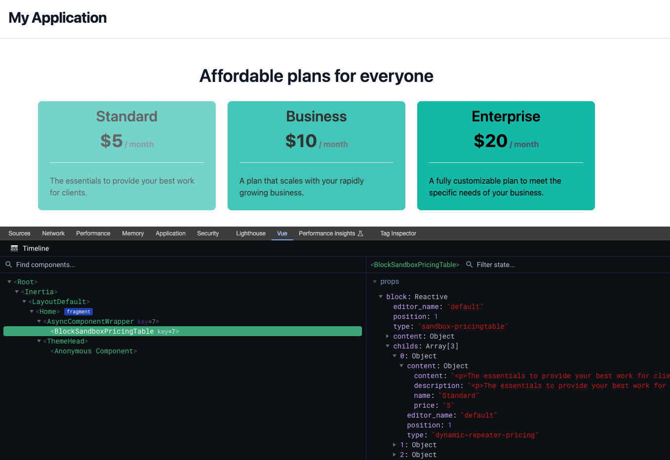
Preview of the Inertia Page
We'll do our best to provide source code of the serie on GitHub